ShopDreamUp AI ArtDreamUp
Deviation Actions


Suggested Deviants


Suggested Collections


You Might Like…


Featured in Groups
Description
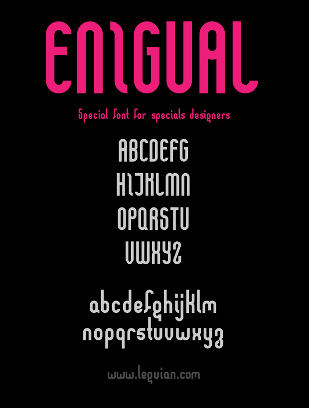
A font that I develop. Interesting for the .otf file ?
Image size
620x820px 88.55 KB
Comments10
Join the community to add your comment. Already a deviant? Log In
Pretty nice design. I particularly like the unusual 'g'. It's also very clever how 'i' and 'j' are designed in such a way that they also work together as digraph which looks like a stencil letter. I personally wouldn't give the typeface such long ascenders and descenders though. Particularly the 'f' looks weird. The 'k' also doesn't look right with its arm going above the x-height.
The slab in 'J' is a bit too long and 'I' looks nice but it's confusing to me. I actually had to look at the name of the deviation entry because 'Enigual' in the picture confused me so much that I couldn't read it. The 'I' actually looks quite like a lowercase 'l' but strangely enough in the context of a capitalized word it looked more like the left half of a 'T'. Still, I think this font has high potential. I also like the letters z and Z.
The slab in 'J' is a bit too long and 'I' looks nice but it's confusing to me. I actually had to look at the name of the deviation entry because 'Enigual' in the picture confused me so much that I couldn't read it. The 'I' actually looks quite like a lowercase 'l' but strangely enough in the context of a capitalized word it looked more like the left half of a 'T'. Still, I think this font has high potential. I also like the letters z and Z.